
I must admit it was an exciting moment when I held my first physically published game in my hand. This project to turn Dancing Queen into a physical game started in Jan 2022, which means it took close to a year to get to this point. The game design was completed in 2021 and the game mechanisms did not change. However turning a free, amateur print-and-play game into a professional product still required much time and energy. This small box that fits snugly in my hand is a culmination of two years of hard work and heart work.

I considered getting the game produced in China, but eventually decided to get a local friend to print it for me. Nicholas runs a printing factory and is not a specialised game manufacturer. Both he and I had a lot to learn about mass producing a hobbyist game. We certainly encountered many challenges and we had to be creative in solving all sorts of problems. The game box is custom made and is not based on any existing box template that Nicholas has. He created a die cut mold specifically for Dancing Queen.
I intentionally went with a cigarette-like box because I felt naughty. A real cigarette box does not actually look like this. I converted Dancing Queen into a pure card game because I wanted it to be easy to carry around. I wanted it to fit inside a shirt pocket or a handbag.

My production cost is high. I use PVC cards. They are strong and waterproof. The colours look vibrant. My cards are all die cut as a whole, as opposed to a two-step process of cutting the straight edges then cutting away the corners. Being die cut means better quality rounded corners. It also means a higher production cost.

The art went through multiple rounds of experimentation and adjustment. I did a market survey before deciding on the Japanese comic style. Among the three art concepts, it was actually my third choice. However I decided to follow what the market wanted. A marketable product is made for the buyer, not the seller. Now that I have been working with this Japanese comic style art for some time, I can no longer imagine Dancing Queen having any other art.
These two above are the card backs of the reference cards. Each player gets one set of four reference cards. One player gets the cards with the red backs, the other the blue backs.

Four reference cards combine to create a reference sheet. Every row represents one card in the game. The left half shows the girl side power, and the right half shows the boy side power. This reference sheet is not just meant for new players. Veterans will find this useful too. They will be able to better guess their opponents' cards, and they can look up this reference sheet to check exactly how many points their opponents will score.

The rulebook is in full colour. I didn't want a black and white rulebook.

One thing that I still need time to get used to is the card names. In the physical version all card names have been changed to become song names. I like this. The original names are easier to remember, but they are a mess of unrelated keywords and phrases. I like that now I have 18 songs I can sing whenever I win with a particular card. I love singing Dancing Queen at my opponent while doing a little dance. At one playtest session, I observed my playtester unconsciously singing a song in the game. Once I heard a playtester hum Never Gonna Give You Up while reading a card. I thought oh no he just gave his card away. I later found out that he didn't actually have that card. It was just that the whole game gave him the vibes which made him hum the song. When I told him there was this song in the game he was tickled.

Assembling the game was quite a bit of work. I was fortunate that IMU, a local medical university, was helping their students look for short term (two-week) internships at the time I needed to do game assembling. I offered two internship slots and got myself two 2nd year medical students. They helped me with some of my training work, and also with assembling Dancing Queen. They were a great help. They were meticulous, careful and proactive. Being able to work on boardgames on an internship is probably a rare thing. They are likely the only two who had this experience this year among their course mates. I gave them both a copy of the game as a souvenir.

I like this Cili Padi Games logo. Cili Padi Games is the brand I am trying to build for my game designs. I tend to like simple logos. Initially I wanted to do a logo which looks like a traditional Chinese stamp. I created a rough sketch and asked Benz to create a logo for me based on that. After a few rounds of experimenting, I settled with this logo. I abandoned the stamp idea, and used this half a taiji icon. Half a taiji in red looks like a chili, which is perfect for the brand name.
One of the reasons behind this brand name is I wanted something with a Malaysian flavour, thus using the Malay word "cili padi" (mini chili). I want to design games which are simple yet clever and packs a punch.

My wife Michelle and younger daughter Chen Rui helped me with some assembly. There are many steps. I sleeve every single card. I have a total of 7500 cards to sleeve. After sleeving cards, I have to pick the 25 cards from their respective stacks. The printing house does not sort the cards for me. 7 out of 25 of the cards are the same - the trophies. That reduces my work a little, but there is still a lot to handle. All this is done manually, not using machines.
One tiring piece of work is folding the rulebook. My rulebook is a long thin sheet of paper which needs to be folded 8 times. Folding this requires high precision and concentration. I have to think through the whole process and define every step. This is tougher work than I expected.

When I received the boxes, they were not fully formed. They were still flat, so that they were easier to transport. I had to open them up then seal the bottom before putting the cards and rules in. Once this is done, there is still one last step - shrink wrapping. When I published my book two years ago I had bought the equipment needed for shrink wrapping. So this time I only needed to buy the plastic sleeves of the right size.

Front cover

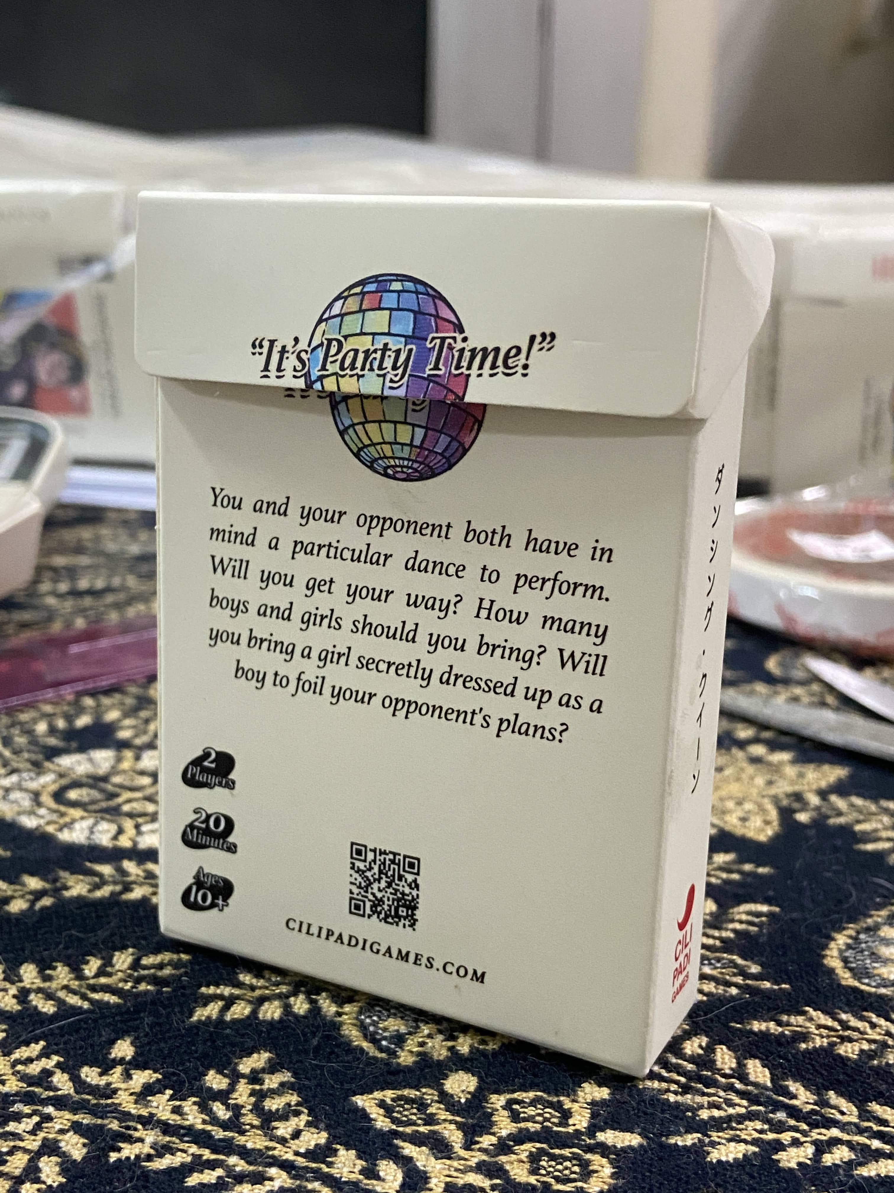
Back of the box

We changed the notation on the cards. In the print-and-play version, I used mostly icons. I found that not everyone understood the icons well. So Edwin helped to change the notation to a combination of text and icons. The text describes the power of the card, and the icons indicate the point values under different situations.
One thematic change we made was the disco ball. It was previously a microphone.
You can buy Dancing Queen at https://www.cilipadigames.com/.
2 comments:
Congrats!! dw
Thank you!
Post a Comment